It's more than a bank, it’s a financial Lifestyle
A lifestyle digital financial app that helps users do all they need in one place (one-stop-shop).
Get the full UI/UX Case Study
Using the double diamond framework, showing how to embrace divergent thinking and present a new personalized experience for the end-user.
Download the full Case Study!
Design Process (Double Diamond)
The design process of the double diamond, which is not linear, so in each phase, I have to revise and edit the previous step to have a tangible outcome that considers a solid reference for my idea.
-
-
Discover
Problem definition
User research
Market research
Synthesize information -
Define
Solution definition
Persona definition
-
-
-
Develop
Information architecture
Services flow
Feature developments
Wireframe/ prototype
UX writing developments
UI elements/ structure
Usability testing -
Delivery
Screens Design
Prototype
Usability testing
-
Synthesize your research
My persona is active and changeable along with the design process, so I did around ten user interviews with more detailed inquiries to collect more details and make my persona alive.
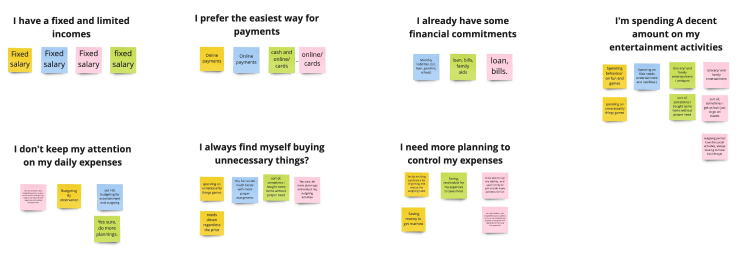
The affinity is used here to characterize the persona that considers my project's base and the primary reference.

Information Architecture (IA)
Categories all the features under a knowable labels that understood by user, by doing card sorting exercises and iterate it many times to have a concrete categories and naming.

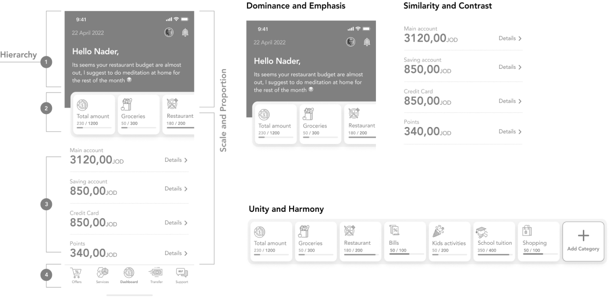
Adapting the visual design principles, giving the user the recognizability of what I meant, by communicating the user empathy.
- Unity and Harmony
- Balance
- Hierarchy
- Scale and Proportion
- Dominance and Emphasis
- Similarity and Contrast
Adding to the top of this is the communication box, which predicts and assists the user by displaying the needed activity with actions, along with the budget component according to the user's priorities.
All the above components took place on the top, using a Golden Ratio proportion to have this aesthetic & balanced view in positioning the design elements.
-
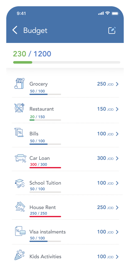
Budget Component
Reserving this spot according to the golden ratio proportion that took the place on the top, to have this aesthetic & balanced view in positioning the design elements. will also assist in the emphasizing & Hierarchy principal in the screen design.
-
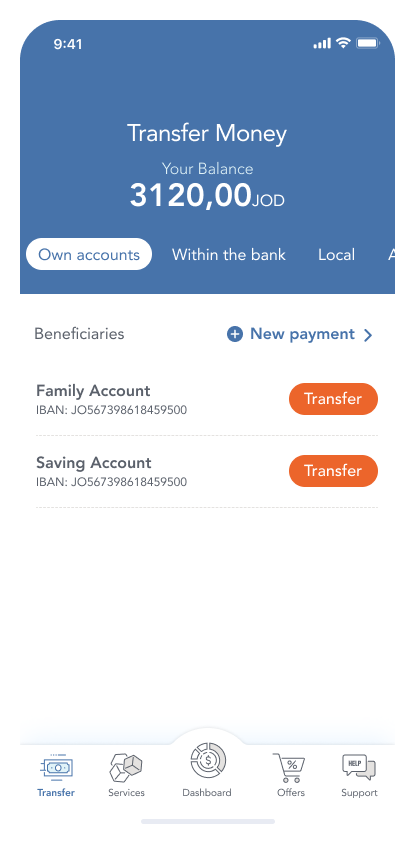
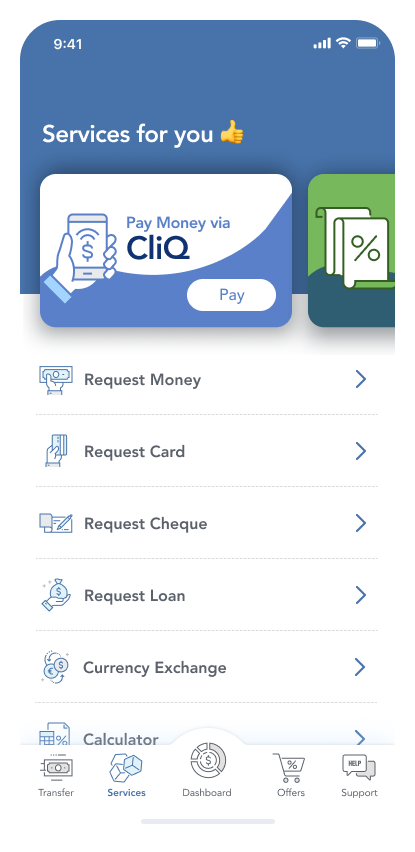
Global navigation
To maintain the accessibility of all the main functions, the best way to implement a sticky action bar that goes over the level one services is to have the easiest way to navigate and explore.
With an emphasis on the dashboard, That gives an overall look and contains the most changed information.
-
Communication area
The communication area is the first spot where the user can see his related messages and interact. build it on a Machine learning approach that can predict and assist user needs
-
Balance Details
its the first area that draw user attention, as was used to display the financial balance status, in a big numbers that make user from the first glance to check his balance with the ability to check the details for each-section

Slider for everything you need :)
Highlights The main categories with expenses indicator with the ability to tap to see the details of each one. The editing budget is there as well by adding or changing the cap.

Speak in your user's voice :)
Talking in your user's voice keeps your messages clear and touchable for them, reserving the top area for announcing and communicating the messages phrased into actions that help to asset and take the right decisions.
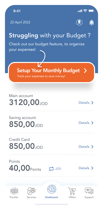
Quick action in need
Applying gadgets for the most needed actions and updates helps for better communication.
